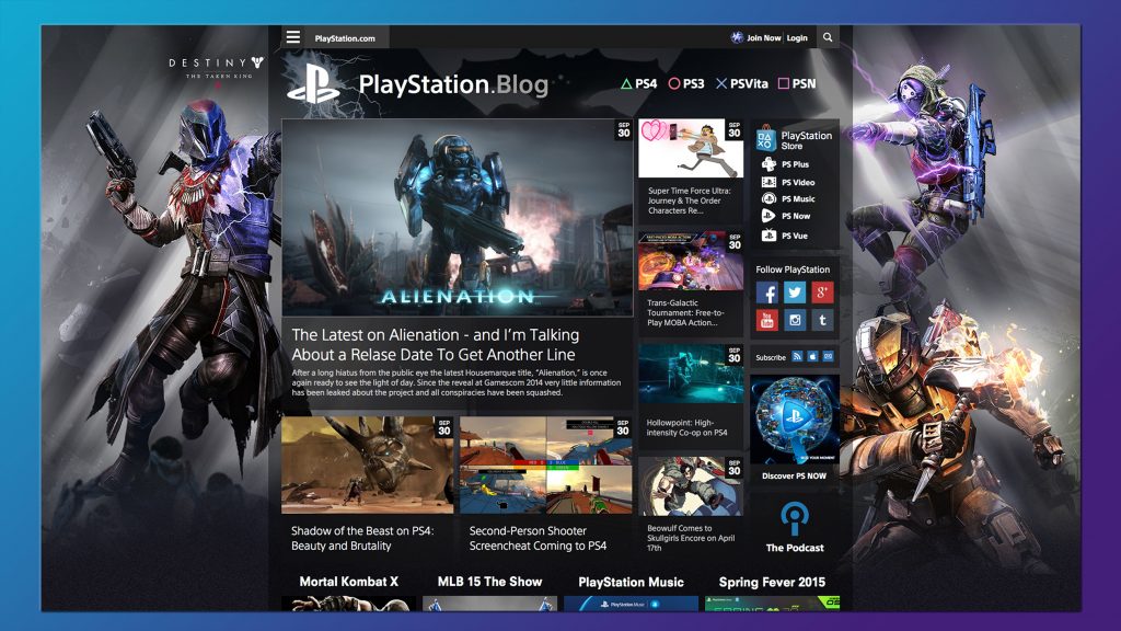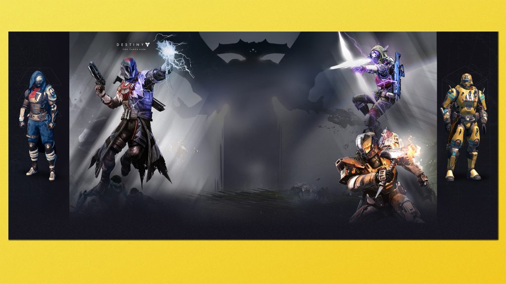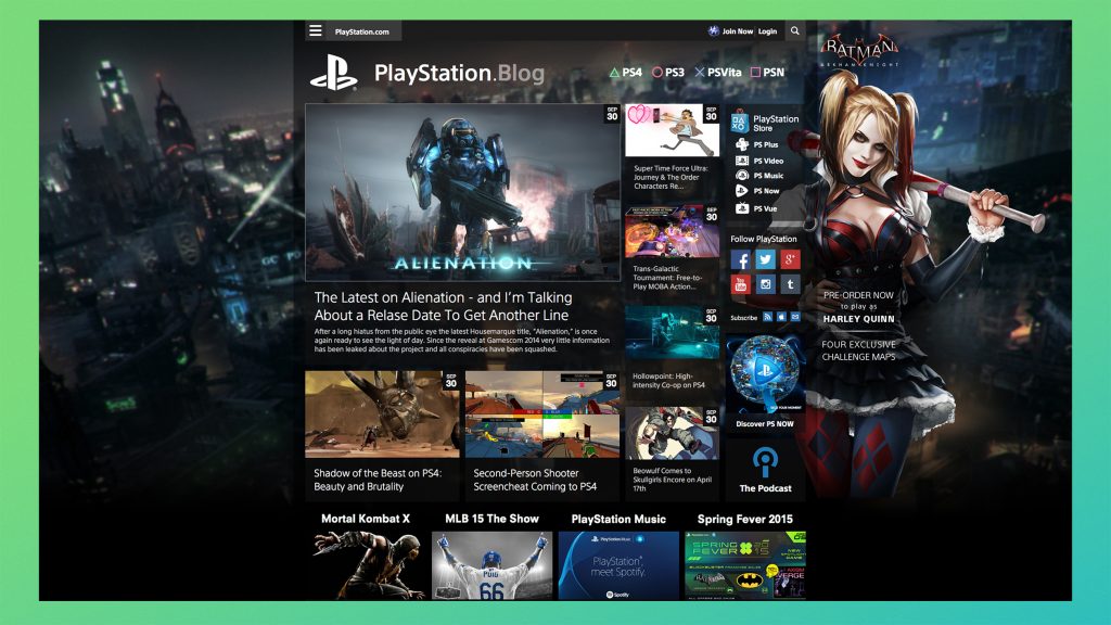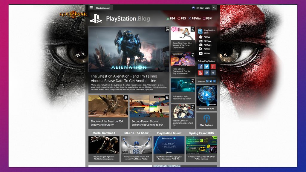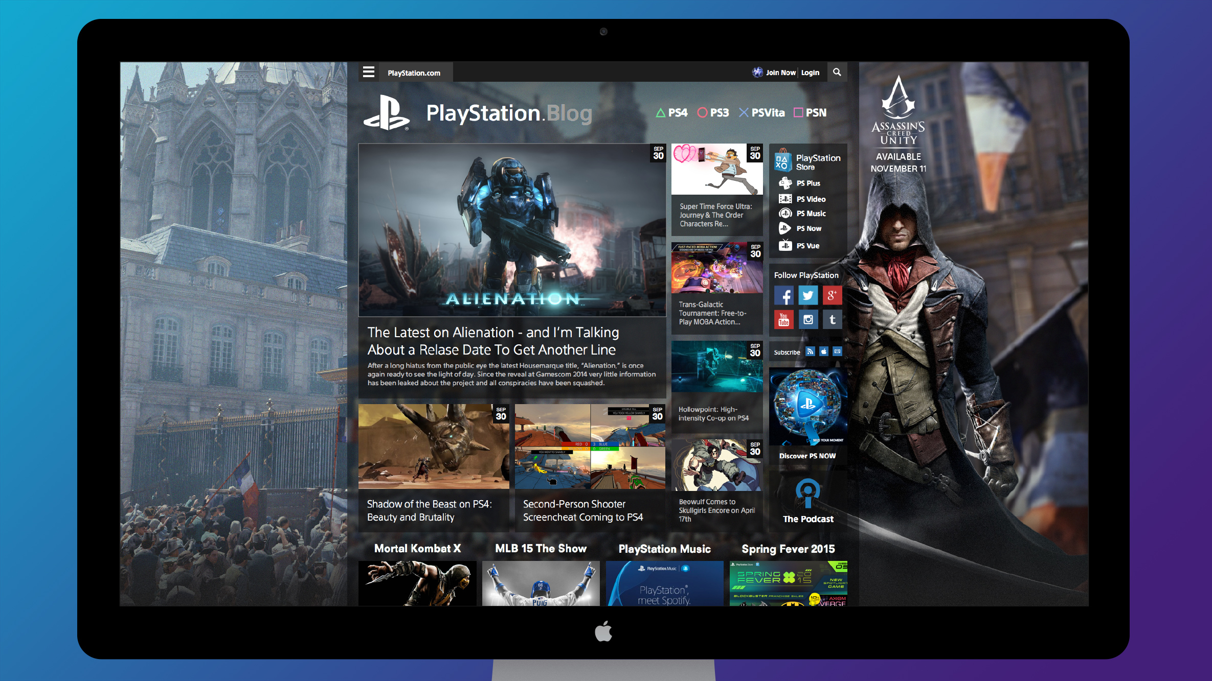
After four years, Playstation.Blog began to show its age. The client wanted to keep the layout and story positions, but change the look of the site. Being a regular Playstation gamer myself, I wanted the design to reflect the elements and typography of the Playstation 4’s interface. I also wanted the site to reflect the diversity of its game library. I solved this by overlaying semi-transparent content blocks over changing backgrounds. This design was extensively tested to make sure that the text was readable on both light and dark backgrounds. The tweaks provided a fresh look for the site and created a very popular promotional location for upcoming titles.
(Concept, design)